
If you live on planet earth, we don’t need to tell you that computers are no longer relegated to stuffy office spaces, or even to laptops — those miracle inventions that gave us the freedom to do our work in Starbucks. No, today you’ve got tablets and smart phones, kids watching YouTube on the school bus, beachgoers reading the news under giant umbrellas.
Consumer habits are changing, and so is web design. Until very recently, if you wanted to hire a company to build your website, you’d need them to create several different versions of your site in order to “fit” it on all those new devices. Actually, many companies still work that way, but here’s the rub: It is impractical and inefficient to design a different version of a website for every device.
Enter responsive web design.
According to web designer and developer Ethan Marcotte, one of the creative forces behind the concept, “Rather than tailoring disconnected designs to each of an ever-increasing number of web devices, we can treat them as facets of the same experience. We can design for an optimal viewing experience …” Hence, web designers are using fluid grids, flexible images, and media queries to build websites that automatically respond to the user’s device and preference.
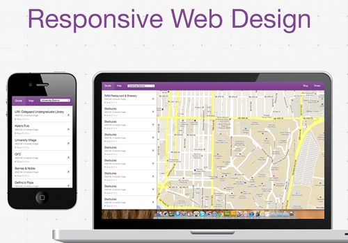
You don’t have to understand tech-speak to get this concept. Basically, it’s like a blueprint. Web designers are now building plans using flexible tools, versus the static tools of our recent past. One quick example: Instead of sizing images in pixels or inches in our code, we size them in percentages, so that every different screen knows what percentage of the page an image should occupy.
What does this actually look like on your end? Do a little experiment. If you’re on a laptop or desktop browser, drag this screen smaller and thinner. Drag it wider. See how the words, images, and columns adjust to the screen size? That’s responsive web design: websites that respond to your needs and fit to whatever device is being used. So, when you pull a responsive website up on your iPhone, it will look the same, too.
The designer John Allsopp quotes the ancient Chinese Tao Te Ching in his discussion of web design. He notes that web designers must work with the ebb and flow of things — that’s what responsive design is all about. Working in harmony with new technologies. Creating elegant designs for a changing world. Giving a unified voice to your vision.
