
Have you looked at your website on a smartphone lately? Which one? Does it look great? Are all the images viewable or have they wandered off the screen? Can you read the text? How does it look on your giant screen for your desktop computer? Still great? No? Perhaps it is time to redo your website using responsive web design.
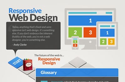
A search on the Internet for “responsive web design” yields 11.5 million results. It’s a big number for an important paradigm shift in the technical process of website design. Wikipedia says that a responsive website is “crafted to use Cascading Style Sheets 3 media queries, an extension of the @media rule, with fluid proportion-based grids, to adapt the layout to the viewing environment, and probably also use flexible images. As a result, users across a broad range of devices and browsers will have access to a single source of content, laid out so as to be easy to read and navigate with a minimum of resizing, panning, and scrolling.”
Translation: The responsive website adjusts its appearance-its layout and even image and text size as well as content-to be optimal for the viewing device, be it a desktop computer with a giant screen, an iPad or tablet, or a smartphone. Magic!
Until the development of this new methodology, you had to write your website code for the giant screen, then rewrite it for the iPad and re-rewrite it for the bigger iPad and once again for one of the smartphones. And what about the other smartphones?
Increasingly, website code is written only one time so that it will magically adjust large images and thumbnails to fit larger and smaller screens as well as expand and condense text. The results: A responsive website that is clean, consistent, and properly styled, regardless of the browsing devise.
Want to see a live example? Visit https://www.blink-tech.com/team on your desktop. Now gradually shrink the window (resize) down to the size of a smart phone. While doing this observe all the elements morphing, adjusting, etc., to accommodate the screen size. Abracadabra!
Since the future of browsing with mobile devices is strong, using the magic of responsive web design for your website makes a great deal of sense but at the same time does not replace the direct need for a mobile plugin to your website to accommodate the specific needs of smartphones.
