
If you own a professionally-built website, it is most likely connected to a Google Analytics account. It is also very likely that all that great data being recorded by Google Analytics is being ignored or forgotten when important marketing and business decisions are being made.
At Blink;Tech, we have proven time and time again by the actual success it has brought to our clients, that web analytics are critical to online marketing success. This is the “Evaluate” portion of our “Build, Promote, Evaluate” model and it is every bit as important as having a well-built website and a robust marketing plan. It is the evaluation of pertinent data that speaks to solid strategy development and sound decision making.
There is, however, one big stumbling block to the evaluation process for most people who need to make decisions that are relevant to their website traffic or internet presence: navigating Google Analytics and understanding and interpreting the data they are seeing. And this is precisely why most analytics data is overlooked or forgotten. Fortunately, there is a solution.
What Exactly is Data Visualization?
Data visualization is taking raw data and putting it in a visual context such as a graph, pie chart, or even a geographic map. While analytics experts can easily spot trends and user patterns in raw data, this can be a daunting task for the everyday business person. Having this data interpreted graphically can really help clarify the impact of marketing efforts, the business environment, and even current events for the untrained eye.
Data visualization clarifies relationships between cause and effect and can show distributions of data, and reveal trends over a specific time period. Some great examples of data visualization are:
Time Graphs
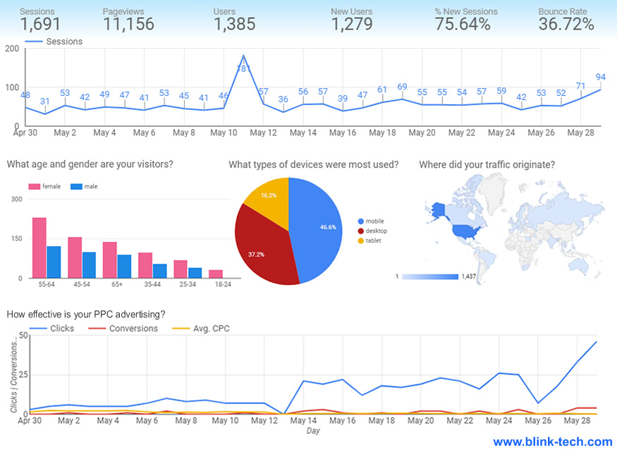
Time graphs are excellent for plotting trends and for associating a change in data with a specific event. When different data sources are plotted over time on the same graph, a very clear picture of cause and effect can be revealed.
Bar Charts
For showing distributions and tendencies in sets of data, bar charts are both easily understandable and effective. They also are a great way to compare compound sets of data, such as the breakdowns of both gender and age of website visitors.
Pie Charts
When you want to show a comparative breakdown of the composition of something, there is no clearer way than a pie chart. In the graphic above, we use a pie chart to show the percentage of device types website visitors are using to access a website
Maps
Maps are great in data visualization for showing geographic distributions and tendencies. For example, a map would be the perfect way to identify an area where a specific blog post resonated and further marketing could be directed or honed to appeal to that location.
Excellent Data Requires Excellent Tracking
For data visualization to be meaningful and effective, the data used must be as complete and accurate as possible. A common situation we encounter with new clients is a Google Analytics account that has been improperly configured. Often important reporting options have not been turned on and other web resources have not been connected. Because Google Analytics is basically a recorder like the black box on an airplane, when data streams are missing, there is no way to turn back the clock to get that data.
But this is only a start. Great marketing requires very detailed data and the only way to get that is to make sure that all marketing efforts are trackable – even down to specific social media posts. Not knowing specific correlations between your marketing efforts and the results of those efforts, could actually be costing you money. This ongoing cycle of evaluation and correction is where data visualization really pays off.
Before you hire anyone to rebuild your website or take on your digital marketing, make sure they not only know and use web analytics, but that they have an effective and clear way to share that data with you. And most importantly, review your web analytics often – that data can effectively inform a surprising amount of important business decisions.
Sign Up for Our Newsletter!
If you enjoyed this article, please sign up for our monthly newsletter by filling out the accompanying webform. It is a great way to stay informed about important tech news, learn some great web marketing tips, and keep up with the latest trends in web security.
You can also follow us on Facebook.
If you have a project you would like to talk to us about, please contact us here.
Thanks for stopping by!
The Blink;Tech Team
