
If you’ve been following us on social media or reading our blogs, you know that we talk a lot about the importance of responsive web design (RWD). This design approach offers a website that can automatically adjust to any screen size, whether it be a large monitor, laptop, tablet, or smartphone. In today’s mobile-centric world, it’s easy to understand why this is so critical to web traffic.
But this relationship between web design and the mobile user is a two way street. Just as websites must adjust to accommodate smaller screen sizes, we who have become accustomed to using those smaller screens are changing in how we prefer to interact with websites, even on a large monitor.
It’s All About the User
After growing accustomed to the clean, easy-to-navigate nature of mobile apps, a website riddled with links, graphics, and non-pertinent information can cause one to grow impatient and frustrated very quickly. Good modern web design takes this into account and is far more focused on the user than ever before. The majority of these design changes have to do with site navigation, but newer sites are now beginning to reflect the influence of mobile technology on our interactions with web technology. In the early days of the web, it was the content that drove the design; now it is the user.
Cleaner Page Layout
Mobile’s most striking impact on mobile web design is a cleaner page layout. Link-heavy, three-column websites are rapidly being replaced with simpler designs that feature bold graphical elements and more focused content. The newness of being able to access any information anytime we want is over. Information is everywhere now, so the game is about who can deliver it with the most clarity and elegance.
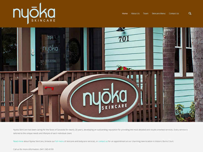 NyokaSkinCare.com is a great example of how bold images set against a clean background can create an elegant look uncluttered by superfluous design elements. The images and colors bring the mood and style of the business directly to the web.
Clearer Navigation
That old expression “I’m all thumbs” takes on a whole new meaning in the mobile age. On a smartphone, pressing a tiny text link with your thumb is no easy task. App designers approached this problem via navigation features with larger contact areas for thumbs. As we have gotten used to the streamlined look of app navigation, we have come to appreciate it in web design as well, and navigation bars in turn have become much simpler and clearer.
Hidden Elements
But how do you keep navigation simple when you have a site with many pages? Hide it! Many websites are dividing their navigation into two separate navigation bars, one of which is only visible when a certain action is performed, such as scrolling or hovering.
Scrolling Is Back
In the days before tablets and smartphones, scrolling had become something to avoid. We wanted the entire contents of every page to fit on the screen, and we wanted users clicking on links to get where they wanted to go. However, on the diminutive screen of a cell phone or tablet, scrolling is the easiest way to navigate, and this has changed our attitude about accessing information this way. As long as the information is pertinent and well-organized, we are happy to scroll down a page. Many smaller websites are now moving toward a single page design where users can simply swipe and scroll to access information, making for a much less cluttered site and, overall, a better user experience.
Flat Design
Flat design is a style of web design where all traces of depth and 3D effects have been removed. It is a reflection of the need for an uncomplicated interface on a tiny screen where shadows and gradients can be tough to appreciate and things need to be punchy and clear. While flat design arose from the need for a cleaner interface, it has become a much-appreciated style that is finding its way onto bigger screens and even in print advertising.
What’s Next for Web Design?
Mobile is having such a profound effect on how we interface with the web that it is hard to predict where things will go next. Amazon has just entered the cell phone market with their new Fire Phone that features “Dynamic Perspective,” a way to scroll, access menus, and reveal hidden information by physically manipulating the phone rather than swiping or pressing a button. If this type of phone interface catches on, there’s no telling how it will explode web design, but one thing is for certain: Right now, tech companies’ main goal is to deliver only what the user seeks, yet have mountains of information only a swipe, tilt, or scroll away.
Sign Up for Our Newsletter!
If you enjoyed this article, please sign up for our monthly newsletter by filling out the accompanying webform. It is a great way to stay informed about important tech news, learn some great web marketing tips, and keep up with the latest trends in web security.
You can also follow us on Facebook.
If you have a project you would like to talk to us about, please contact us here.
Thanks for stopping by!
The Blink;Tech Team
