
At long last, all the pieces for your business website are in place: It’s quite snappy, it’s very informative, it works great, and it attracts a great deal of traffic.
Because of the amazing growth in smartphone usage recently, online information has to be presented not only for a full-size computer screen, but also in a smaller, more portable way. And, importantly, it must be delivered clearly and immediately to consumers when and where they need it.
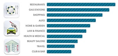
As demonstrated in the graphic above, Restaurant, Retail, and Auto are at the top of a long list of highly searched categories.
What exactly is it that people are looking for when they use their smartphones? They want easy-to-access contact information (i.e., phone number to call, map, driving directions, etc.). If your site is not optimized for mobile viewing, it may lead not only to consumer frustration (and lack of business) but also-and this is worse-your site may be filtered out of mobile search results altogether.
Many websites contain analytics mechanisms that track visits to a site and provide a surplus of other traffic, geographic, and demographic data. Fortunately, this data can also tell you what type of device your visitors are using when they view your site. Thus, you will know how to optimize properly and what information is most important to those users.
These days you want your glorious website to work well on full-size computer AND on a tablet. Heck, you even want it to work well on a smartphone because you know people will seek out your business’s offerings while they are on the go! Move your Internet presence to this next step. Grow your business offerings to serve your customers and clients with exactly what they need when they reach your business online using their desktop computer, their tablet, their smartphone, or when they are standing on your doorstep.
