
Yes, we are making another blog post about the importance of having a mobile-friendly website with responsive web design. If you are tired of hearing about it, good news! It will all be over after April 21, when the Internet faces what some are calling … #Mobilegeddon. On that day, you could lose a great portion of your website traffic. Don’t say we didn’t warn you!
It all started with a blog post
As you are probably aware, Google’s search algorithms have long been a hot topic for all of us in web development, Internet marketing, and SEO. Usually Google makes an announcement every time there is any major change with their algorithms, but rarely do they give much detail, which leads to a lot of conjecture and buzz among the web-savvy. But back in February of this year, Google did something unprecedented: In a seemingly innocuous blog post, they specifically announced that on April 21, 2015, they would expand their “use of mobile-friendliness as a ranking signal.”
That might not seem like a powerful statement in the grand scheme of things, but to all of us who follow Google’s very understated announcements and have seen the astounding increase in mobile web traffic over the past two years, this is the equivalent of Google throwing a brick through a window with a note on it. And that note reads, “Get mobile-friendly, or suffer the consequences.” Honestly, until the algorithm changes roll out it is hard to say how much it will affect non-responsive websites, but the search giant has made other, much more passive algorithm warnings in the past that have drastically altered search results and sent SEO experts scrambling to help their clients regain lost traffic. This time we know exactly what Google wants. And this is precisely why many are calling this “Mobilegeddon.”
How do you know if your website will be affected by #Mobilegeddon?
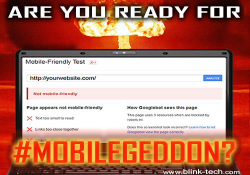
Have you visited your own website on a smartphone or tablet? Does it resize for the display and have a mobile-friendly menu? Is it easily navigable? If not, you could be facing the wrath of Mobilegeddon. The best and quickest way to tell if your site is on the mobile search chopping block is to use the Google Mobile-Friendly Test.
Whether or not your website is mobile-ready, you should see this as an opportunity to get a leg up on your competition and make any needed changes. So, don’t forget to plug in your competitors’ websites into the Google Mobile-Friendly Test and see how they do. For large corporate websites that consist of thousand upon thousands of pages with a broad range of functionality, making the change from non-mobile to mobile-friendly is a major undertaking that can take months to roll out. I’m sure you’re thinking that big companies would be way ahead of the curve on this one, but you would be surprised. A recent Tech Crunch study found that 44% of the websites of Fortune 500 companies failed Google’s Mobile-Friendly Test. Pretty shocking!
If your website doesn’t pass the Google Mobile-Friendly Test and you are facing Mobilegeddon, give us a call at  941-374-4546 or drop us an email!
